A big question that a lot of beginner watercolorists struggle with is: How can I paint with a limited watercolor palette?
I’m here to tell you that you absolutely don’t need an enormous collection of watercolor paints to be able to produce beautiful paintings.
The caveat here is that you need to be judicious with your introductory color selection to maximize your mixing potential to include both dark and light value.
Down the track, you will be able to build upon this starting collection of colors as you progress!
What is a limited palette?
Definition: Selecting the smallest range of colors to create the widest range of tones to paint with.
This typically involves selecting the smallest quantity of paint (no more than 6) tubes (or pans) required to maximize a range of colors to paint with.
These selected paints will not include a white pigment required for creating tints or black pigments (or burnt umber) to emulate shade.
Such limited palettes can be altered to suit our painting style or subject matter (e.g. muted tones, intense contrast, warm temperature, portraits, landscapes etc). However, a simple primary color palette will bring you VERY far.
Benefits of a limited palette for watercolor painting
It may be a little surprising to know that a narrow selection of pigments can actually bring several benefits to your watercolor art practice.
Affordability
The clear advantage is affordability. Especially when starting out, a luxurious set of 80 colors from artist-grade brands such as Daniel Smith seem very ‘out-of-budget’ for many, and it can be frustrating having to compromise the quality of art materials when opting for a cheaper alternative.
However, by choosing a limited palette of these brands, you are able to keep prices low while gaining access to the BEST watercolor paints on the market.
Color Mixing
With a limited color palette at your disposal, you forcibly propel yourself into the world of color mixing which can greatly improve your painting skills.
You will learn the relationship between pigments and their corresponding values as well as discovering what hues you can create simply by combining other pigments.
Less choice
This my sound a little counter-intuitive but the fact is, when you’re using a small range of colors, there are simply less choices to make with regard to the palette of your artwork.
At times, this can be a liberating feeling opposite to being overwhelmingly paralyzed or burdened with color variety, detracting from the actual painting process itself.
Improved color harmony
Embracing a restricted color palette will encourage greater visual organization and improved color harmony in you paintings.
This is due to the avoidance of color “dissonances” that may occur due to an iffy choice of certain pigments to use in tandem with each other.
Primary triad
This is the MINIMUM color palette you need for painting.
This simple primary triad traditionally consisting of a red, yellow and blue will shock you with how big of a color range you can reach with THREE paint tubes or pans!
These three colors are the true fundamentals of color theory as 3 primaries can theoretically yield the full spectrum.
In reality however, the color appearance of the primary colors you choose will restrict your ability to create different hues due to warm or cool bias.
This means that you will not have access to the full spectrum of color at your disposal but still have GREAT color mixing potential.
RGB color model
Take a look at this red, green, blue color wheel from Watercolor Affair created with a primary triad consisting of Hansa Yellow Deep, French Ultramarine and Pyrrol Scarlet.
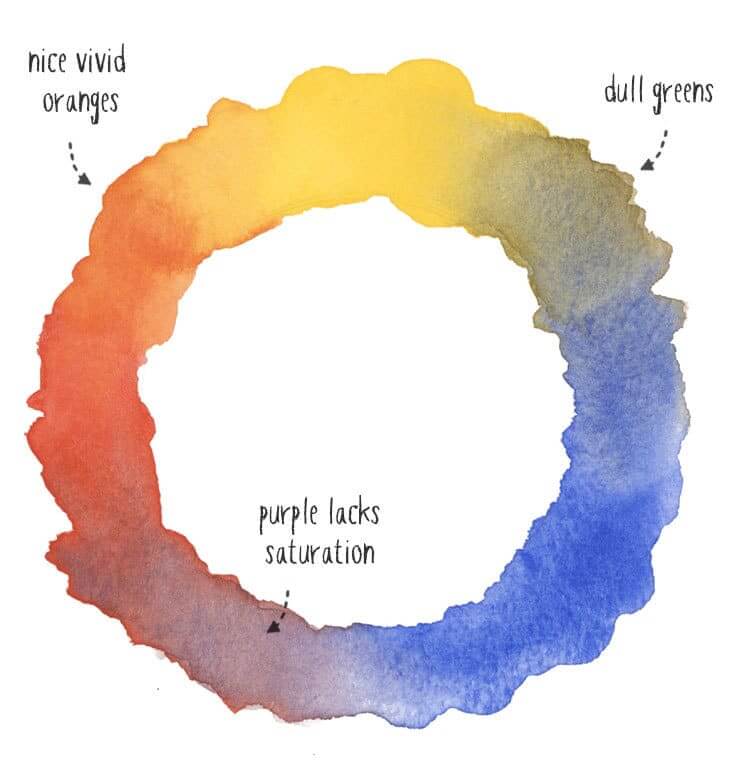
It is clear that although a good range of color can be achieved, you are really limited saturation-wise with your purples and dull greens.
Instead, I’d recommend the following model if you’re going to go with a triad.
CYM color model
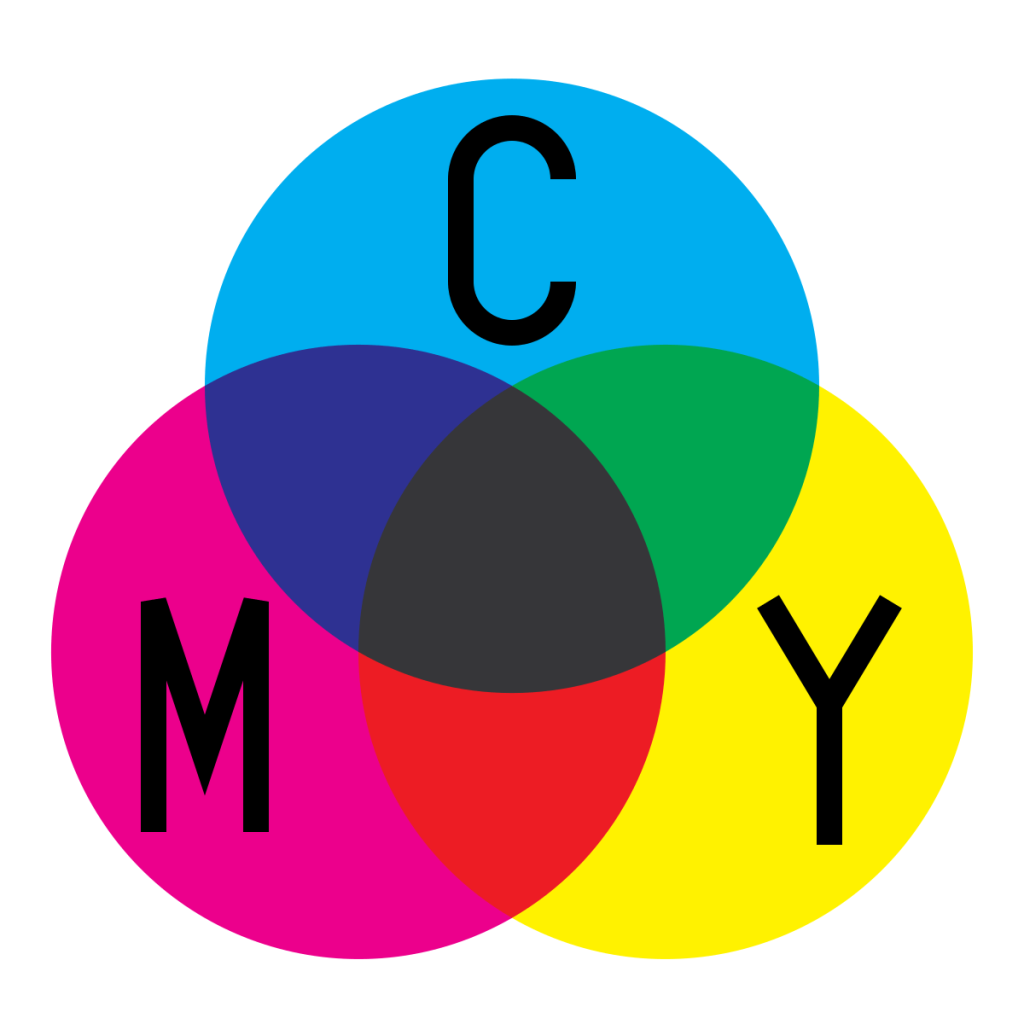
The cyan, yellow, magenta model is the one I’d recommend when choosing a triad limited watercolor palette.
The CYM model is regarded as the “true” primary triad that is used in modern printing that addresses the saturation issues created by the RGB model.
You will find with this triad selection that both greens and purples will be more intense and vivid, indicating a more versatile range that you can work with.
Despite being a little more difficult to achieve with less vibrant oranges and blues (pointing toward the imperfections of this model), this color system is taught widely in art schools for its color mixing possibilities.
Remember:
This is the base-line “stock standard” limited color palette that you can choose. There are plenty of other possible combinations that you can choose and cater to your specific painting style or subject matter.
- Raw Sienna
- Light Red
- French Ultramarine
Monochromatic

A simple, monochromatc color palette has MANY benefits for your watercolor painting.
Here are some of them:
- By limiting the palette to a single color, the composition becomes central to the overall artwork with the viewer’s eye being drawn mainly by shape language and line work.
- Draws greater attention to artwork’s form and structural features
- Develops a unique and interesting aesthetic
- Enhances and accentuates texture of artwork
- Enhances underlying message that artworks attempt to communicate (this is commonly achieved with a splash of warm color against a heavy cool palette typically seen in Banksy’s work)
Anders Zorn palette
Anders Zorn is a Swedish painter, sculptor and etcher who obtained international success using an alla prima style and limited palette.
What made Zorn especially unqiue was his very few color choices:
- Yellow Orchre
- Ivory Black
- Cadmium Red
- Titanium White
Despite using this palette in his oil painting, these colors can be translated easily over to watercolor works that exude the same mood he famously depicts.
Landscape palette
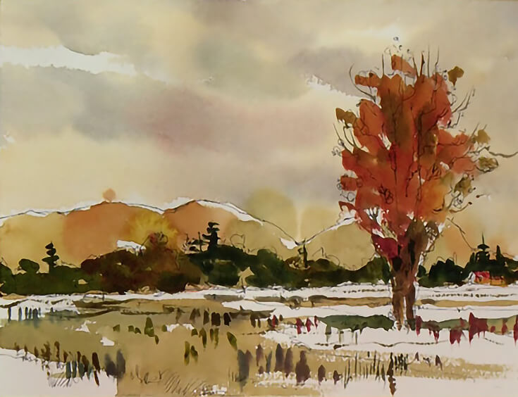
I love plein air painting and landscapes is subject matter I always seem to fall back to. The great thing is, you don’t need a lot of colors in order to paint incredible sceneries.
A good list of pigments I’d recommend is:
- Cadmium Yellow: warm pigment great for summer moods, mixing for autumn hues
- Transparent Yellow: capable of being mixed for shades of foliage
- Cadmium Red: warm pigment for sunsets and interesting highlights
- Sap Green: earthy and mossy transparent pigment
- Burnt Sienna: for painting autumn scenery, forestry and earthy landscapes
- Cobalt: sky, snow and lake landscapes
- Ultramarine: sea, deep lakes and ocean locations
You definitely do not need the entire list above. A select few will take you very far in your landscape paintings!
Split Primary Palette
This 6 color watercolor palette solves several of the limitation of the color triads that forms another foundational palette for many artists.
The split primary palette famously includes one cool and one warm variant of each primary color, ultimately combining the best of both RYB and CYM color models together.
By using this palette…
Your mixing potential increases exponentially compared to the triads previously mentioned due to the degree of saturation capable of being achieved with all colors of the spectrum.
Essentially, ALL colors of the color wheel can be mixed to be bright, vivid and saturated.
8 Watercolor Palette
The ultimate beginner color palette is the 8 watercolor palette which would allow you to mix ANY color available on the color wheel.
These are my recommended pigments to choose from:
- Hansa Yellow Deep
- Lemon Yellow
- Phthalo Green BS
- Phthalo Blue GS
- French Ultramarine
- Quinacridone Rose
- Pyrrol Scarlet
- Burnt Umber
However…
Instead of these, it is very possible that you build your OWN palette of your choosing that better suits your needs. For these people, I’d recommend building on top of the split primary palette to ensure your foundation colors are set.
The key difference of this 8 watercolor palette is the inclusion of the highly versatile Burnt Umber pigmetn, capable for producing incredible earth tones, intense blacks and interesting grays.
Burnt umber is capable of being mixed with ANY of the other pigments to create very interesting alternative hues that can be used in your works.
The following mixing chart below is credited to Watercolor Affair to help you visualise the color potential of this small palette.

Monet palette
Claude Monet was a founder of French Impressionist movement who helped transform fine arts and painting in the second half of the 19th century.
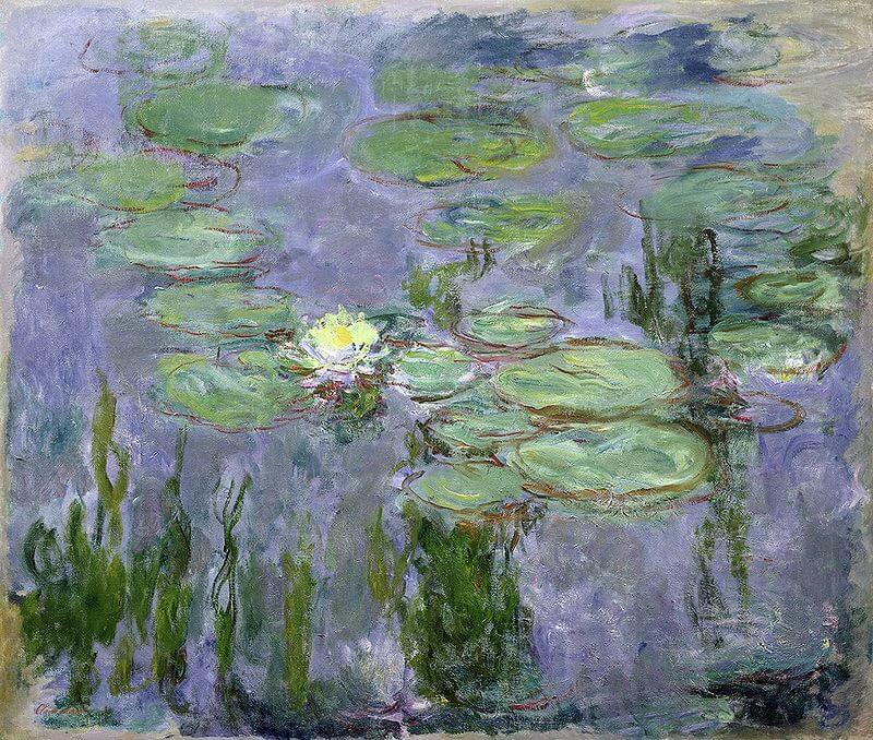
Monet’s paintings were luminescent and wonderfully colorful that captured nuanced tones in shadows and played with the vibrancy of light.
His amazing paintings were created with a limited palette with the fewest pigments to achieve beautiful tones.
- Cadmium Yellow Light
- Cadmium Yellow Medium
- Alizarin Crimson
- Cadmium Red Light
- French Ultramarine
- Flake White
Van Gogh palette
Vincent van Gogh was a post-impressionist painter whose work was notable for its striking color, emphatic brushwork, contoured forms and mimetic interjection of his personal life.

Quintessentially, Van Gogh’s body of work that consisted between 700 and 800 pieces conveys a sense that true spirituality is discovered in nature.
- Ultramarine Blue: deep rich blues
- Prussian Blue: darker blue hues that were used to create “Starry Night”, “Cafe Terrace at Night”
- Yellow Ochre: natural earth pigment, warm golden moods
- Cadmium Yellow: bright, intense yellow pigment
- Chrome Yellow: lemon-yellow pigment
- Vermilion: bright red pigment
Summary
Now that you understand how beneficial and practical a limited palette for watercolor painting can be, it’s time to commit to one that resonates with you and not look back.
With even a palette of 3 colors, the spectrum of colors you are able to tap into is quite remarkable and I encourage you to start painting with one to find out.
Good luck with your watercolor endeavors!

Leave a Reply